Empowering the No-Code Journey:
Esferasoft's Transformation of My
Mobile App


About the Client
My Mobile App, a product built on no code, intends to assist companies in converting their websites into full-fledged native mobile apps without having to write a line of code. Small and medium-sized enterprises, in particular, can use it to brand and publish apps on Android and Apple systems. With many SMBs wanting to go mobile but not wanting the complexities and costs involved in traditional app development, MyMobileApp came into being to democratise app development. Esferasoft came in to improve the user experience, scale it up, and realise the full potential of the platform’s vision.

The Starting Point
My Mobile App effectively addressed the practical challenges that enterprises face today when they want to establish a mobile presence but often lack the necessary time, funds, or technical expertise to develop and manage applications using traditional methods. The platform was bold and clear about its proposition of value. However, the interface needs a little refinement. The challenge is minimal but also massive: how do we create an experience of app building that is welcoming to non-technical users but robustly keeps native-level functionality?


Our Journey Begins
Esferasoft partnered with My Mobile App to bridge this gap. Our task was to not develop a new solution but improve the one already available. The first step was mainly concerned with improving the app-building flow, increasing backend scalability, and ensuring the platform can support everything from personal blogs to growing shopfronts—all while keeping the interface clean and simple for the end user.
Discovery & Insights
We have started by trying to immerse ourselves in the end-user mindset. Through stakeholder interviews, user testing, and behaviour mapping, we identified common pain points: too much information at the onboarding stage, insufficient visual guidance, and a gap between what users expect from a “no-code” experience and what the interface actually does.


What was the most crucial realisation? They were building not just an app; they were building a brand. That understanding would inform everything that followed.
The Strategy Phase
Knowing well both the intentions and frustrations of users, we drew up a road map centring on three strategic pillars:
Lowering the Barrier to Entry
The user journey had to feel as easy as roaming around a website – no jargon, no friction.
Engagement Driving
We must prioritise push notifications and real-time content syncing without frightening the user.
A Scalable Architecture for Growth
Be it a bakery owner or an e-commerce entrepreneur, the platform needs to evolve with the user’s growth.
Execution & Innovation
Our design and development teams worked in lockstep, rebuilding the UX from scratch with a modular outlook:

Guided Setup Flows
Step-by-step processes replaced static menus, helping users build apps with clarity and confidence.

Dynamic Templates
A user-blogger, retailer, or service provider could possibly employ an appropriate module from among design modules that best befits the type of use, thereby enabling easy personalisation.

Performance Optimization
Codes were restructured, and load times were reduced along with optimisation across the entire spectrum of Android and iOS environments.

Push Notification Integration
The end users now had access to a really easy-to-use dashboard whereby they could easily target and schedule messages for their audience.
The Roadblocks We Overcame

What is the most challenging aspect of designing an interface? The challenge lies in striking a balance between simplicity and complexity. How can one design an interface that easily communicates with the novice while offering robust features and capabilities?
Striking visual clarity in interface design versus rich functionality was not easy. Every feature had to earn its place. Other issues included app store submission flows, device compatibility, and backend load management, all of which needed to be considered for a seamless UX.
The Impact & Results
This redesigned platform was not just a pleasing face-lift; it was a complete transformation. After launch:

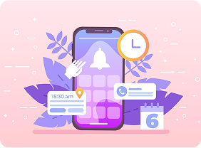
More users engaged with the new, improved onboarding and guided flows.
The toolkit enabled a person without any tech experience to publish mobile apps on Google Play and the App Store within record time and sometimes even in just a day.
Push notifications became a twofold method of allowing businesses to stay in touch with customers.
Support requests dropped, indicating the improvements in usability and overall customer satisfaction.Â
My Mobile Application was more than just an application; it was a confidant in matters of digital growth.

A Journey of Simplicity, Scalability, and Impact
We, at Esferasoft, believe that technology is all about empowerment and not intimidation. My Mobile App and Esferasoft have created another example of what happens when great design meets exquisite technology, soaked in a palpable understanding of the user. Together, we did not just build an interface; we built confidence for a small business owner stepping into the mobile arena for the first time.
Brilliant ideas deserve excellent execution to ensure that everyone benefits.